App Settings & Preferences
Feature Detail
Description
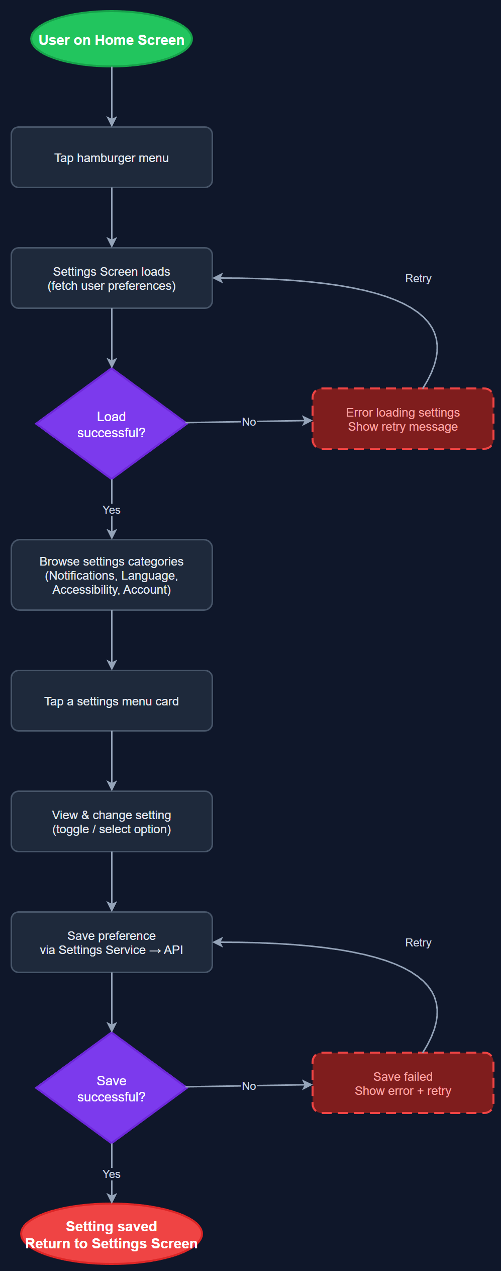
The App Settings & Preferences feature provides a structured settings screen accessible via the hamburger menu, presenting categorized configuration options as tappable menu cards. Users can manage personal preferences such as notification settings, language, accessibility options, and linked accounts. The settings screen serves as the central hub for user-controlled configuration, ensuring users can adjust app behavior to match their personal needs and assistive technology requirements without navigating deep menu trees.
User Flow
Analysis
A well-structured settings screen is foundational to accessibility compliance and user autonomy. Users relying on assistive technologies such as screen readers or large text must be able to configure their preferences within the app rather than relying solely on OS-level settings. For organizations serving users with diverse cognitive and sensory profiles, in-app configuration reduces friction and support burden. The settings screen also provides the entry point for account management, logout, and organization switching, making it a critical safety valve for multi-organization users and coordinators managing multiple associations.
Implemented as a Flutter screen with a scrollable list of settings menu card widgets, each navigating to a sub-screen or triggering an action. Settings persistence uses a lightweight local key-value store (e.g., shared_preferences) for UI preferences, with server-synced settings (notification preferences, language) persisted via REST API to the PostgreSQL backend. The settings repository abstracts both storage backends behind a clean interface. WCAG 2.2 AA requires that all interactive menu cards have descriptive semantic labels, logical reading order, and keyboard/switch-access navigation support. The hamburger menu trigger must meet minimum touch target size requirements.
Dependencies
Definition of Done
Components (62)
Shared Components
These components are reused across multiple features
User Interface (16)
Service Layer (13)
Data Layer (9)
Infrastructure (20)
User Stories
No user stories have been generated for this feature yet.